Just a small bonus post. When coming up with the new banner design for the York Vision games page, I experimented a little to see if I came up with a style I liked. There are a few images that predate the ones shown here, but they've unfortunately gotten lost in the depths of the internet and office servers.
These two were my first designs. They don't really pay much attention to page width, and the characters on the side would end up stretching into the body of the page...
The waves were a bit too uniform, so I went for something more customised - a chain of 'nodes' and connecting lines intertwining with eachother. Amusingly, I got this idea from a Pokémon Card. The character now has a pattern of circles to be propped on, and to give them a bit a framing.
The basic finished design. I removed a layer of Nodes since it looked to cluttered, and changed the font. The font coloring was taken from Digi-Boy on the right, but they later became a fixed scheme on subsequent banners, and for headings in articles themselves.
The Finished design, set to fit the page dimensions of the newspaper, and at a resolution Adobe InDesign would like. The pattern of the Nodes had to be extended so it fit right across the page.
Tuesday, 6 July 2010
Games Banner Evolution
Labels:
Art and Design
Article Catchup: York Vision Issue 208
The last of the articles I've written this year, and what will be my penultimate issue with York Vision.
This was to be another issue with a guest writer; but that entirely fell through - and very close to the dealine, leaving things in a bit of a hazardous state.
The main deal with this issue was the report on E3, but due to the sheer scale of content that took place during the Nintendo, Sony, and Microsoft conferences (saying nothing of the conferences held by other publishers), there was no way I'd be able to cram in all the information I wanted to discuss; especially not on a single page. I will post the extended versions of the conference reports on here.
The Paper Mario article was a replacement for the AWOL entry from the guest writer; and honestly isn't anything outstanding. I found out here that the way Adobe InDesign deals with cutting out images is in no way Sprite-friendly. I had to take steps to make sure the edges of Mario and friends weren't prematurely sliced off.
This was to be another issue with a guest writer; but that entirely fell through - and very close to the dealine, leaving things in a bit of a hazardous state.
The main deal with this issue was the report on E3, but due to the sheer scale of content that took place during the Nintendo, Sony, and Microsoft conferences (saying nothing of the conferences held by other publishers), there was no way I'd be able to cram in all the information I wanted to discuss; especially not on a single page. I will post the extended versions of the conference reports on here.
The Paper Mario article was a replacement for the AWOL entry from the guest writer; and honestly isn't anything outstanding. I found out here that the way Adobe InDesign deals with cutting out images is in no way Sprite-friendly. I had to take steps to make sure the edges of Mario and friends weren't prematurely sliced off.
Article Catchup: York Vision Issue 207
It's a miracle this article turned out how it did. Although I planned for the content in advance (A mixture of being able to do my own research at a gaming expo event, and holding another brainstorming session at The Spriters Resource Community), when it came to production week, I had fallen very ill. I dragged myself to the offices to get some of the work done - and succeeded - but it was with barely any of the formatting and style that I normally try to put into my work. Things looked pretty dire.
Fortunately, the Editor who ranked above me was able to work on the page in my absence, and saved it from being a complete train wreck. I was eventually able to get my shit sorted, and added the formatting finishing touches. You can tell that some of the layout features aren't in my usual style, but in a way it makes the page look even fresher. The background gradient turned out way too desaturated though.
While I do complain about my situation in York Vision, there were at least one or two people who cared enough to look out for me. I'm lucky.
Fortunately, the Editor who ranked above me was able to work on the page in my absence, and saved it from being a complete train wreck. I was eventually able to get my shit sorted, and added the formatting finishing touches. You can tell that some of the layout features aren't in my usual style, but in a way it makes the page look even fresher. The background gradient turned out way too desaturated though.
While I do complain about my situation in York Vision, there were at least one or two people who cared enough to look out for me. I'm lucky.
Article Catchup: York Vision Issue 206
By this point I had settled into a rhythm with making pages for the paper. While the placement of the content varied from issue to issue, a lot of the basic templating carried over, making the construction of new pages a fairly speedy process.
Since the main draw of the issue was the Pokémon HeartGold & SoulSilver review, the Banner for the page was added to include a Pokéball, and featured a vector art of Rotom by Raylax. (The man has some skills, mad props to him).
The Pokémon review was nothing special. Compared to other publications (y'know, the ones people pay for and actually read), they had much more time and space to go into a fair bit more detail about the game than I did, which is probably the most crippling restriction with only having a single page to work with every issue. My main aim was to appeal to the people who haven't played the games - or maybe who only played the first generation of Pokémon installments - to give this new game a try. I never saw anyone with a Pokéwalker around after this got published; so I suppose I failed.
The Beat Hazard Vs. Audiosurf article was fun to write. The hardest part was fitting all the information on the page in an attractive way; especially with trying to cram screenshots of both games on there. What I ended up with wasn't haf bad, in my opinion.
Since the main draw of the issue was the Pokémon HeartGold & SoulSilver review, the Banner for the page was added to include a Pokéball, and featured a vector art of Rotom by Raylax. (The man has some skills, mad props to him).
The Pokémon review was nothing special. Compared to other publications (y'know, the ones people pay for and actually read), they had much more time and space to go into a fair bit more detail about the game than I did, which is probably the most crippling restriction with only having a single page to work with every issue. My main aim was to appeal to the people who haven't played the games - or maybe who only played the first generation of Pokémon installments - to give this new game a try. I never saw anyone with a Pokéwalker around after this got published; so I suppose I failed.
The Beat Hazard Vs. Audiosurf article was fun to write. The hardest part was fitting all the information on the page in an attractive way; especially with trying to cram screenshots of both games on there. What I ended up with wasn't haf bad, in my opinion.
Article Catchup: York Vision Issue 205
Now that I'd managed to get an entire page published on my own, it was time to step up my game. Issue 204 looked good (at least to me), but there were flaws. Although the page looked good on the screen, a lot of the images came out blurry and at a low resolution. The circuit board background was light enough to have the text above it readable, but it could still have done with tweaking.
I took these flaws on board, and corrected them with Issue 205. As a result, this one is probably my favourite in terms of layout. With the old format established by the previous Editor kicked to the curb, I was free to go for column articles, and features of varying lengths. The banner and background adapted to a different colour completely flawlessly. Changing the colours cheme was as easy as cake, and made the page look brand new each time.
This issue was to feature a guest writer, and has since been the only issue to do so. His original request was to do a review (Bioshock 2) which would have been an incredible help; I didn't have easy access to an Xbox 360 or a PS3 at the time, so he could appeal to an audience I could not. However, it turned out that he canceled on this idea at the last moment, and instead submitted AtmosFEAR. The article was fine (if wordy); but it left me in a hard-pressed position to come up with a review.
Therefore, the Ace Attourney Investigations review didn't arrive in best condition, and actually made print with a few bad typos still intact. It was all horribly embrassing.
The Co-Op gaming article was much better. The 5 games were thought up between me and the (mostly) lovely members of The Spriters Resource Community. Playing with a friend is quite possibly the greatest joy in gaming for me, and this article reflected that.
I took these flaws on board, and corrected them with Issue 205. As a result, this one is probably my favourite in terms of layout. With the old format established by the previous Editor kicked to the curb, I was free to go for column articles, and features of varying lengths. The banner and background adapted to a different colour completely flawlessly. Changing the colours cheme was as easy as cake, and made the page look brand new each time.
This issue was to feature a guest writer, and has since been the only issue to do so. His original request was to do a review (Bioshock 2) which would have been an incredible help; I didn't have easy access to an Xbox 360 or a PS3 at the time, so he could appeal to an audience I could not. However, it turned out that he canceled on this idea at the last moment, and instead submitted AtmosFEAR. The article was fine (if wordy); but it left me in a hard-pressed position to come up with a review.
Therefore, the Ace Attourney Investigations review didn't arrive in best condition, and actually made print with a few bad typos still intact. It was all horribly embrassing.
The Co-Op gaming article was much better. The 5 games were thought up between me and the (mostly) lovely members of The Spriters Resource Community. Playing with a friend is quite possibly the greatest joy in gaming for me, and this article reflected that.
Labels:
article,
Capcom,
Point 'n' Click,
review
Article Catchup: York Vision Issue 204
This Issue is where I became the main Editor for the Games Page on the York Vision newspaper - at least partially because no one else was interested in doing the job. A bit of a hollow victory; but it meant that I now had full stylistic reign over the page; and I was completely set on changing the old ugly format that existed before.
The great thing to come out of this was that I now was having my photoshop and graphical design skills tested, along side my writing. Taking on a position with the newspaper is something that I am never going to regret - I've improved so many skills!
The order of the day was to come up with a design that was simple, modern, and clean; but also reflected the gaming aspect the page was about. I tried out a few test designs (Which, have since probably have gotten lost in the aether...); and settled on the 'node' design below. The way it was set up meant that I could change the colour scheme and the character on the right at will.
The texture at the bottom was taken from www.cgtextures.com, referred to me by an internet friend; and it's definitely helped me with various photoshoppery since.
I'm very happy with the articles in this one. Torchlight is a great game produced by a small, not very well-known company. While a lot of student gamers may be using Steam as a vehicle for playing PC games, not all of them might be aware of the hidden gems that it sells.
The interview with Tyvon Thomas is the first professional interview I've ever done, and it was a total thrill. Since then, his site has grown a lot! Head over to www.pixelxcore.net and check it out. Tell 'em GrooveMan sent you.
The great thing to come out of this was that I now was having my photoshop and graphical design skills tested, along side my writing. Taking on a position with the newspaper is something that I am never going to regret - I've improved so many skills!
The order of the day was to come up with a design that was simple, modern, and clean; but also reflected the gaming aspect the page was about. I tried out a few test designs (Which, have since probably have gotten lost in the aether...); and settled on the 'node' design below. The way it was set up meant that I could change the colour scheme and the character on the right at will.
The texture at the bottom was taken from www.cgtextures.com, referred to me by an internet friend; and it's definitely helped me with various photoshoppery since.
I'm very happy with the articles in this one. Torchlight is a great game produced by a small, not very well-known company. While a lot of student gamers may be using Steam as a vehicle for playing PC games, not all of them might be aware of the hidden gems that it sells.
The interview with Tyvon Thomas is the first professional interview I've ever done, and it was a total thrill. Since then, his site has grown a lot! Head over to www.pixelxcore.net and check it out. Tell 'em GrooveMan sent you.
Labels:
indie,
interview,
PixelXCore,
review,
RPG,
Runic Games
Article Catchup: York Vision Issue 202
It's been a while since I update here last, but I've definitely not stopped writing. I've finished an entire year working for the York Vision newspaper; and as such I've racked up a nice collection of articles.
Some of these articles I have saved .jpg copies of, so you can see the layouts of the pages too.
This issue, 208, is one of the earlier papers back when I wasn't the main editor for the games page. This meant that I had no say over the stylistic choices for the layout, which was... pretty bad.
The decision to do Style Boutique/Style Savvy as a review largely spawned from a dare imposed by a friend. After trying it out, I found it to be a really unique experience; so doing a review of something outside my gaming comfort zone sounded like something special. I'm happy with how the article itself turned out - even if the badly stretched images pretty much ruin the final piece.
The Gaming Cookbook feature I've already posted here - this was the issue it was meant to be a part of. It's nothing special - and in retrospect, not as funny as I thought it was. Ho hum.
Some of these articles I have saved .jpg copies of, so you can see the layouts of the pages too.
This issue, 208, is one of the earlier papers back when I wasn't the main editor for the games page. This meant that I had no say over the stylistic choices for the layout, which was... pretty bad.
The decision to do Style Boutique/Style Savvy as a review largely spawned from a dare imposed by a friend. After trying it out, I found it to be a really unique experience; so doing a review of something outside my gaming comfort zone sounded like something special. I'm happy with how the article itself turned out - even if the badly stretched images pretty much ruin the final piece.
The Gaming Cookbook feature I've already posted here - this was the issue it was meant to be a part of. It's nothing special - and in retrospect, not as funny as I thought it was. Ho hum.
As a side note, I'd actually produced images for both of my articles to appear in this issue, but they weren't included in this version of the page. Before this issue went to print I was able to restructure the Style Boutique article to have better-fitting images and the image I took.
Labels:
article,
fighter,
Nintendo,
review,
simulation
Wednesday, 2 December 2009
On the Menu: Pesky Plumbers a lá mode - Mario & Luigi Bowser's Inside Story
No screenshots, unfortunately. This game refuses to be emulated in No$GBA, and I don't like using stock screenshots. Sorry. D=
The Mario series of video games is one that's recognised the world over, from devoted video game fans to your gran. In the nearly 30 years he's been around, he's starred in more video gaming genres than most would care to count (or have even heard of). Some of his exploits have been incredibly successful - Everyone loves Mario Kart and the Super Mario games - others less so. The less said about Mario Teaches Typing, the better.
But one group of games from this pop culture giant has been a bit understated; the Mario Role Playing Games (RPGs). Acclaimed by fans for being a breath of fresh air from the Final Fantasies and Oblivions out there, they've always been packed with humour and series references, bundled up in bright, happy colours and an easy-to-learn control scheme.
The newest incarnation of these games is Mario & Luigi: Bowser's Inside Story for the Nintendo DS; and thankfully it stands up to the high standards the previous games have set for it. To break the plot down; Bowser's regular plans to kidnap the Princess Peach and ruin everyone's day goes awry when he's tricked into eating a dubious 'Vacuum Shroom'. Instead of just capturing the princess, he ends up inhaling her... along with the Mario Brothers. From there the game plays out as Bowser from the outside and the Mario Bros. from the inside. The lush Mushroom Kingdom that our anti-hero traverses switches almost seamlessly to his neon, cartoon-y insides as you switch back and forth to solve puzzles. This is a biology lesson like you've never seen before; when Bowser needs to do some heavy lifting, Mario sprints off to his biceps, thwacking his muscles with a hammer to make them tense up. When there's a wall too tall to jump over in Bowser's stomach, have him guzzle water from a fountain, flooding the area and letting you continue. As the game progresses, new puzzles taking advantage of Bowser's abstract anatomy are served to you, right up to the final moments of the game. A few of the tasks take a little longer than they held my interest for, and the infrequent instances where you use the stylus to play a minigame could be unresponsive, but then the next cool body part opens up to play with (Kicking around pollen in Bowser's nose to make him sneeze? Very gross, very fun), and the stagnant moments are quickly forgotten.
But it's not all just playing around in Bowser's body, there are fights with enemies to be had! In a lot of RPGs the battles are turn-based, and all it takes to smack the foe silly is a single button press. Not quite so here; while you still have to wait for your turn in battles, you're not allowed to relax - well timing your button presses during your attacks will rack up the damage, have Mario and Luigi do some cool acrobatics, and you get to feel really cool and involved. You even defend attacks that way. If you're hardcore enough, you can avoid any and all damage! Bowser's battles also work this way, but being the gigantic turtle monster that he is, his attacks are much slower and stronger. While the Mario. Bros team up to perform combination attacks, Bowser throws out brutal left hooks and scorching fire breath. He can even use the vacuum ability he's gained to swallow his enemies whole, delegating the battle to the plumbers inside him. While there's a lot to perform and experiment with, it's all very intuitive. And a good thing too, because the fights get steadily more demanding as the story goes on with steeper penalties should you fail to dodge attacks. There's even a Challenge Mode - er - Challenge Node for you to really test out your skills.
While this game can be enjoyed by anyone with a DS and a sense of humour (and that's you, right?), Nintendo fans will get a lot more out of this - it's stuffed to the nines with references and jabs at the gaming company's history. The way Bowser has almost a fatherly pride for the Goombas and Koopa Troopers he employs as his army (weak enemies that Mario stomps on a day to day basis) can't fail to crack a smile.
The Mario series of video games is one that's recognised the world over, from devoted video game fans to your gran. In the nearly 30 years he's been around, he's starred in more video gaming genres than most would care to count (or have even heard of). Some of his exploits have been incredibly successful - Everyone loves Mario Kart and the Super Mario games - others less so. The less said about Mario Teaches Typing, the better.
But one group of games from this pop culture giant has been a bit understated; the Mario Role Playing Games (RPGs). Acclaimed by fans for being a breath of fresh air from the Final Fantasies and Oblivions out there, they've always been packed with humour and series references, bundled up in bright, happy colours and an easy-to-learn control scheme.
The newest incarnation of these games is Mario & Luigi: Bowser's Inside Story for the Nintendo DS; and thankfully it stands up to the high standards the previous games have set for it. To break the plot down; Bowser's regular plans to kidnap the Princess Peach and ruin everyone's day goes awry when he's tricked into eating a dubious 'Vacuum Shroom'. Instead of just capturing the princess, he ends up inhaling her... along with the Mario Brothers. From there the game plays out as Bowser from the outside and the Mario Bros. from the inside. The lush Mushroom Kingdom that our anti-hero traverses switches almost seamlessly to his neon, cartoon-y insides as you switch back and forth to solve puzzles. This is a biology lesson like you've never seen before; when Bowser needs to do some heavy lifting, Mario sprints off to his biceps, thwacking his muscles with a hammer to make them tense up. When there's a wall too tall to jump over in Bowser's stomach, have him guzzle water from a fountain, flooding the area and letting you continue. As the game progresses, new puzzles taking advantage of Bowser's abstract anatomy are served to you, right up to the final moments of the game. A few of the tasks take a little longer than they held my interest for, and the infrequent instances where you use the stylus to play a minigame could be unresponsive, but then the next cool body part opens up to play with (Kicking around pollen in Bowser's nose to make him sneeze? Very gross, very fun), and the stagnant moments are quickly forgotten.
But it's not all just playing around in Bowser's body, there are fights with enemies to be had! In a lot of RPGs the battles are turn-based, and all it takes to smack the foe silly is a single button press. Not quite so here; while you still have to wait for your turn in battles, you're not allowed to relax - well timing your button presses during your attacks will rack up the damage, have Mario and Luigi do some cool acrobatics, and you get to feel really cool and involved. You even defend attacks that way. If you're hardcore enough, you can avoid any and all damage! Bowser's battles also work this way, but being the gigantic turtle monster that he is, his attacks are much slower and stronger. While the Mario. Bros team up to perform combination attacks, Bowser throws out brutal left hooks and scorching fire breath. He can even use the vacuum ability he's gained to swallow his enemies whole, delegating the battle to the plumbers inside him. While there's a lot to perform and experiment with, it's all very intuitive. And a good thing too, because the fights get steadily more demanding as the story goes on with steeper penalties should you fail to dodge attacks. There's even a Challenge Mode - er - Challenge Node for you to really test out your skills.
While this game can be enjoyed by anyone with a DS and a sense of humour (and that's you, right?), Nintendo fans will get a lot more out of this - it's stuffed to the nines with references and jabs at the gaming company's history. The way Bowser has almost a fatherly pride for the Goombas and Koopa Troopers he employs as his army (weak enemies that Mario stomps on a day to day basis) can't fail to crack a smile.
Monday, 27 July 2009
Who's Afraid of the Big Bad Dire Wolf?
Games have progressed a hell of a lot over time. That's something of an obvious statement when you look at the complex and powerful capabilities of the current-gen consoles compared to the Ataris and the Commadores of old, but the way we look at game design has changed also.
Due to a combination of limited graphics, sound, and memory, the earliest games couldn't show or tell you much. If a game was to have a plot, it was all told via text - usually in the instruction manual. As such, all early games had very simple objectives, and simple reasons for doing so. Why shoot the undulating blobs of pixels in Space Inavder? Because they're invaders! From Space! It's hardly the work of Dickens.
In a bit of nerd-culture overlap, tabletop RPGs (Dungeons and Dragons being the flag-bearer of the genre, to... mixed responses) were often used as examples for how early games with a limited ability to "show, not tell" could generate a game world for the player to experience. In Japan, this is the initial concept (along with the graphics push the Nintendo Entertainment System provided) behind both Dragon Quest and Final Fantasy, but before that there were games like Wizardry.
While Wizardry wasn't the first digitised Tabletop RPG (that would go to the 1980s game Rogue, a game represented entirely in ASCII, and shared a few similarities with the games at hand), it was definitely one of the most popular series of its time. Back then, Wizardry was famed for the way it was involved in the conception of a one-day extremely popular genre, creating many, many gameplay devices still used today. Now, Wizardry is immortalised for being SOUL CRUSHINGLY HARD.
This is just conjecture on my part, but I would wager that the difficulty of the Wizardry games (all 8 of them, with the 4th being especially ball-busting) was to extend the lifespan of the game. Not everyone can afford (or even want to) buy a game regularly, and having a game be rediculously hard is a very efficient if sadistic way of achieving that. The games boasted such wonders as missable items that're required to progress in the game; foes and traps that can kill you with little to no warning or respite (with your save game being deleted if you die); and even a hidden timer that will kill the player's party of adventuers of old age if you took too long to complete it.
Needless to say the series was a mega hit in Japan, to the point where a spin-off company started producing remakes and new games under the Wizardry name, actually outliving the American company. One of the hardest and most unfair games series in history had changed gaming forever.
But wait! The tale does not end there. Atlus (who I've mentoned before as one of the primary RPG publishers) recently released what can only be described as a love letter to the halcyon days of extremely difficult dungeon exploration. That love letter is The Dark Spire for the Nintendo DS. It's Wizardry in almost every sense of the word (Wizardry 2, if you want to get specific); right down to the way characters are created, the complex and very retro battle mechanics, and the Excuse Plot to rule them all (There's a tower with a wizard in it. He stole some royal jewelery, so go kick his ass! Who cares if he's actually doing anything with it!).
However, they've gone to some lengths to modernise; and honestly, they'd have to. As old games were limited by their hardware; with no such limitations present, it'd be a total waste to not make use of them. The game has 2 'modes'. A 'Modern' mode with brooding, gothic graphics offset by a trippy neon colourscheme; and a 'classic' mode that drags things right back to their roots - The graphics become 8-bit and almost entirely monochrome. The impressive soundtrack also changes between full capability and 8-Bit chipsets, which continues to impress me. Every time I heard a new song, I switched the mode to classic to hear the retro version.
Of course, the battles and the way the dungeon exploration works changed extremely little from the games it's birthed from; but that's not necessarily a good thing. While the sillier rules such as dying of old age are removed for the sanity of the masses - unfair fights and swift deaths still run rampant. Death of a party member is a very significant loss - reviving a dead character is extremely expensive; money is hard to come by, and you need every penny to be able to rest at the inn when needed. Poison traps are introduced as early as the tutorial dungeon, and will kill a character in seconds (you take damage for every 'step' you make in the dungeon) if not immediately treated.
While the first few floors do contain weak monsters to fight, the game will (at complete random) throw a significantly harder fight at you, usually as punishment for exploring (you seem to encounter stronger enemies more often when discovering new ground, rather than treading old areas). It's usually hard to run from these, and if you're caught off guard - such as when you're heading to the dungeon exit to heal up - the battles usually result in a swift game over. My favourite situation was in a fight against the 'Floating Coins' enemy. They have an attack that can hit all members of the party; but it only does 1 damage per person, often not doing damage at all. I initially laughed these off, until the game made me fight FIFTEEN of these at once. All of them using that attack, and coincidentally not failing to damage so much anymore...
Difficult battles you can eventually take in your stride, but what really bugged me about this game were the very complicated and obscure menu screens. The game will very happily give you starting items and equipment, but not tell you that it's not already equipped. You can't see the effectiveness of new items until you've bought them - and no, just because it's more expensive doesn't make it better. The most irritating thing of all is that one of the buttons will delete an item from your inventory with no insurance message - and by that same vein, will let you use an item on any character without any failsafes. This will lead to incredibly fustrating situations where you'll accidentally (and irreversibly) throw away that expensive mace you've just bought, or use your last antidote on a member that's not poisoned.
The game has a professional finish, but it belies extremely outdated gameplay. It's nice to be able to visit (or re-visit) a time where RPGs were presented in the rawest essence imaginable - and there's a rediculous amount of party customisation to be had with a brain-bendingly interwined experience/skill/magic/job system; but it always feels more than a little unfair - the game is very rarely on your side, and the effort you put into what you achieve is only passingly rewarded.
If you thought RPGs today are too easy, then by all means dig into this demon of a game. You're a stronger man than I. Pikachu and friends feel oh-so comforting.
Due to a combination of limited graphics, sound, and memory, the earliest games couldn't show or tell you much. If a game was to have a plot, it was all told via text - usually in the instruction manual. As such, all early games had very simple objectives, and simple reasons for doing so. Why shoot the undulating blobs of pixels in Space Inavder? Because they're invaders! From Space! It's hardly the work of Dickens.
In a bit of nerd-culture overlap, tabletop RPGs (Dungeons and Dragons being the flag-bearer of the genre, to... mixed responses) were often used as examples for how early games with a limited ability to "show, not tell" could generate a game world for the player to experience. In Japan, this is the initial concept (along with the graphics push the Nintendo Entertainment System provided) behind both Dragon Quest and Final Fantasy, but before that there were games like Wizardry.
While Wizardry wasn't the first digitised Tabletop RPG (that would go to the 1980s game Rogue, a game represented entirely in ASCII, and shared a few similarities with the games at hand), it was definitely one of the most popular series of its time. Back then, Wizardry was famed for the way it was involved in the conception of a one-day extremely popular genre, creating many, many gameplay devices still used today. Now, Wizardry is immortalised for being SOUL CRUSHINGLY HARD.
This is just conjecture on my part, but I would wager that the difficulty of the Wizardry games (all 8 of them, with the 4th being especially ball-busting) was to extend the lifespan of the game. Not everyone can afford (or even want to) buy a game regularly, and having a game be rediculously hard is a very efficient if sadistic way of achieving that. The games boasted such wonders as missable items that're required to progress in the game; foes and traps that can kill you with little to no warning or respite (with your save game being deleted if you die); and even a hidden timer that will kill the player's party of adventuers of old age if you took too long to complete it.
Needless to say the series was a mega hit in Japan, to the point where a spin-off company started producing remakes and new games under the Wizardry name, actually outliving the American company. One of the hardest and most unfair games series in history had changed gaming forever.
But wait! The tale does not end there. Atlus (who I've mentoned before as one of the primary RPG publishers) recently released what can only be described as a love letter to the halcyon days of extremely difficult dungeon exploration. That love letter is The Dark Spire for the Nintendo DS. It's Wizardry in almost every sense of the word (Wizardry 2, if you want to get specific); right down to the way characters are created, the complex and very retro battle mechanics, and the Excuse Plot to rule them all (There's a tower with a wizard in it. He stole some royal jewelery, so go kick his ass! Who cares if he's actually doing anything with it!).
However, they've gone to some lengths to modernise; and honestly, they'd have to. As old games were limited by their hardware; with no such limitations present, it'd be a total waste to not make use of them. The game has 2 'modes'. A 'Modern' mode with brooding, gothic graphics offset by a trippy neon colourscheme; and a 'classic' mode that drags things right back to their roots - The graphics become 8-bit and almost entirely monochrome. The impressive soundtrack also changes between full capability and 8-Bit chipsets, which continues to impress me. Every time I heard a new song, I switched the mode to classic to hear the retro version.
Of course, the battles and the way the dungeon exploration works changed extremely little from the games it's birthed from; but that's not necessarily a good thing. While the sillier rules such as dying of old age are removed for the sanity of the masses - unfair fights and swift deaths still run rampant. Death of a party member is a very significant loss - reviving a dead character is extremely expensive; money is hard to come by, and you need every penny to be able to rest at the inn when needed. Poison traps are introduced as early as the tutorial dungeon, and will kill a character in seconds (you take damage for every 'step' you make in the dungeon) if not immediately treated.
While the first few floors do contain weak monsters to fight, the game will (at complete random) throw a significantly harder fight at you, usually as punishment for exploring (you seem to encounter stronger enemies more often when discovering new ground, rather than treading old areas). It's usually hard to run from these, and if you're caught off guard - such as when you're heading to the dungeon exit to heal up - the battles usually result in a swift game over. My favourite situation was in a fight against the 'Floating Coins' enemy. They have an attack that can hit all members of the party; but it only does 1 damage per person, often not doing damage at all. I initially laughed these off, until the game made me fight FIFTEEN of these at once. All of them using that attack, and coincidentally not failing to damage so much anymore...
Difficult battles you can eventually take in your stride, but what really bugged me about this game were the very complicated and obscure menu screens. The game will very happily give you starting items and equipment, but not tell you that it's not already equipped. You can't see the effectiveness of new items until you've bought them - and no, just because it's more expensive doesn't make it better. The most irritating thing of all is that one of the buttons will delete an item from your inventory with no insurance message - and by that same vein, will let you use an item on any character without any failsafes. This will lead to incredibly fustrating situations where you'll accidentally (and irreversibly) throw away that expensive mace you've just bought, or use your last antidote on a member that's not poisoned.
The game has a professional finish, but it belies extremely outdated gameplay. It's nice to be able to visit (or re-visit) a time where RPGs were presented in the rawest essence imaginable - and there's a rediculous amount of party customisation to be had with a brain-bendingly interwined experience/skill/magic/job system; but it always feels more than a little unfair - the game is very rarely on your side, and the effort you put into what you achieve is only passingly rewarded.
If you thought RPGs today are too easy, then by all means dig into this demon of a game. You're a stronger man than I. Pikachu and friends feel oh-so comforting.
Thursday, 25 June 2009
5 Street: Ultimate Campness in 3 Easy Steps
Hey there! Do you want to be considered an awkward social oddity in both real life and on the Internet? Do you want to watch and learn physically impossible dance moves that will get you odd looks from the public? Do you want to want to listen to terrible pop songs - and love every second of it?
Then you should play Elite Beat Agents. But if that sounds like too much effort for you, then you can play the Dancing MMO 5 Street!
5 Street is... an experience, and you too can achieve the sheer pinnacles of flamboyant dress and bad dancing that only an imported Korean game can provide!
Step One: Take an existing idea, and bring it Online.
A whole bunch of modern-day Massively Multiplayer Online games are doing this as of late. Initially MMOs were the sole territory of RPGs (Who hasn't heard of World of Warcraft?), but since that market's getting saturated; there are a whole bunch of other game genres left untapped. 5 Street's main 'gimmick' is to be an MMO about dancing. Y'know, like the movies High School Musical and Step Up. But films are non-interactive, which isn't prime videogame material; so an actual game has to be cribbed from also.
The obvious choice here are rhythm and music games. That genre is pretty synonymous with the Guitar Hero and Rock Band series now (unfortunately), but stealing ideas from those two would be a bit too obvious; as would be taking cues from Dance Dance Revolution. So they copied the system from a dancing game called Bust a Groove, an old PlayStation 1 number with a small fanbase... and gameplay that had very little to do with rhythm at all. Unlike the aforementioned games, Bust a Groove requires no rhythm feeling or musical sense at all - just good reactions and the ability to tell left from right. What better system could be aimed at non-gamer preteens?
Step 2: Camp it Up to the Max
We're dealing with an audience the developers assume have the attention span of a flea on a sugar rush, and are naturally drawn to anything brightly coloured, amazingly pretty, and can be dressed in whatever they can get their hands on. Oh yes, and they must be girls. Because everyone knows girls will accept any and every game you give them as long as it has the Cute factor in unhealthy levels. In real life, this is how kitch fashion shops start up. In videogames, this is how you make a game bewilderingly silly in design.
Even from the initial loading screen (and what a loading screen it is), you are thrown head-first into a subculture of fashion that the average guy - sexuality notwithstanding, before stereotypes start flying around - would have never come across before; or would start running from very quickly in the other direction if they had. Everything stays relatively 'normal' if a female character is chosen, but... interesting things start happening if you play as a guy.
Although a lot of the functions in the game are gender specific (a lot of graphical changes, along with 'Lovers' dance mode being reserved for male/female couples only), the majority of the dance moves in the game are gender specific, leading to dance routines that are either hillarious or horrifying, depending on your sense of humour.
This extends to the clothing avalable in the game too. I have to credit the designers here - they went to some lengths to ensure you can create a vaguely cool-looking outfit, with new clothes appearing very regularly (you have to pay real money to wear 90% of them, though). But for every sharp suit or edgy dj getup, there's a leather vest and vinyl hotpants combo to offend the eyes.

The music you dance to is quite literally under the influence of public opinion. In what's probably the most blatant disregard of copyright laws in a videogame ever; players can submit their favourite songs to the powers that be, and sooner or later they show up ingame; including swear-heavy gangsta rap and lite-metal. Before you know it you're gyrating to tunes from Lady Gaga to Sum 41 to Easy E (the latter surprised me), with a smattering of Korean Pop left over from before the localisation. The genres are varied just enough to have you find a song or 3 that you honestly enjoy, even as a guilty pleasure.
Step 3: Actually... enjoy yourself?
Despite all of this - despite the camp clothing, the stolen gameplay, and the arguably (if you're unlucky or hate Top 40 tunes) terrible music; 5 Street is inexplicably fun. Even though the dancing system has nothing to do with rhythm whatsoever, it can get genuinely challenging as you start performing better. The stunting system is extremely satisfying, as you pull of headspins, backflips, and the Worm in rapid sucession as cheering sound effects go off, sparkles go EVERYWHERE, and your score skyrockets.
The items you can buy for free are limited, but some look so good you're tempted to splash some loose change - before you realise you're broke. Some of the graphics look a little cheap, and there's next to no area for you to explore (it's not really that kind of MMO), it's well built, and some of the areas are honestly pretty.
As with nearly all free-to-play MMOs there's not enough addictive content to last you more than a week without paying some cash, and if any of your manly-man friends catch wind of you playing this, you'll be resigned to a life of mockery; but it's a silly, cheap way to waste an extended weekend.
Oh, and as a side note, despite the child-friendly arrangement of it all, if you decide to get a 'Lover' in-game, you may marry and then have sex with the significant other. In glorious, poorly modeled 3D. I've not seen it first hand (I'm a clean little games reviewer), but when I saw the item shop stocked condoms, the camp playing experience suddenly became a hell of a lot more awkward...
Then you should play Elite Beat Agents. But if that sounds like too much effort for you, then you can play the Dancing MMO 5 Street!
5 Street is... an experience, and you too can achieve the sheer pinnacles of flamboyant dress and bad dancing that only an imported Korean game can provide!
Step One: Take an existing idea, and bring it Online.
A whole bunch of modern-day Massively Multiplayer Online games are doing this as of late. Initially MMOs were the sole territory of RPGs (Who hasn't heard of World of Warcraft?), but since that market's getting saturated; there are a whole bunch of other game genres left untapped. 5 Street's main 'gimmick' is to be an MMO about dancing. Y'know, like the movies High School Musical and Step Up. But films are non-interactive, which isn't prime videogame material; so an actual game has to be cribbed from also.
The obvious choice here are rhythm and music games. That genre is pretty synonymous with the Guitar Hero and Rock Band series now (unfortunately), but stealing ideas from those two would be a bit too obvious; as would be taking cues from Dance Dance Revolution. So they copied the system from a dancing game called Bust a Groove, an old PlayStation 1 number with a small fanbase... and gameplay that had very little to do with rhythm at all. Unlike the aforementioned games, Bust a Groove requires no rhythm feeling or musical sense at all - just good reactions and the ability to tell left from right. What better system could be aimed at non-gamer preteens?
Step 2: Camp it Up to the Max
We're dealing with an audience the developers assume have the attention span of a flea on a sugar rush, and are naturally drawn to anything brightly coloured, amazingly pretty, and can be dressed in whatever they can get their hands on. Oh yes, and they must be girls. Because everyone knows girls will accept any and every game you give them as long as it has the Cute factor in unhealthy levels. In real life, this is how kitch fashion shops start up. In videogames, this is how you make a game bewilderingly silly in design.
Even from the initial loading screen (and what a loading screen it is), you are thrown head-first into a subculture of fashion that the average guy - sexuality notwithstanding, before stereotypes start flying around - would have never come across before; or would start running from very quickly in the other direction if they had. Everything stays relatively 'normal' if a female character is chosen, but... interesting things start happening if you play as a guy.
Although a lot of the functions in the game are gender specific (a lot of graphical changes, along with 'Lovers' dance mode being reserved for male/female couples only), the majority of the dance moves in the game are gender specific, leading to dance routines that are either hillarious or horrifying, depending on your sense of humour.
This extends to the clothing avalable in the game too. I have to credit the designers here - they went to some lengths to ensure you can create a vaguely cool-looking outfit, with new clothes appearing very regularly (you have to pay real money to wear 90% of them, though). But for every sharp suit or edgy dj getup, there's a leather vest and vinyl hotpants combo to offend the eyes.
The music you dance to is quite literally under the influence of public opinion. In what's probably the most blatant disregard of copyright laws in a videogame ever; players can submit their favourite songs to the powers that be, and sooner or later they show up ingame; including swear-heavy gangsta rap and lite-metal. Before you know it you're gyrating to tunes from Lady Gaga to Sum 41 to Easy E (the latter surprised me), with a smattering of Korean Pop left over from before the localisation. The genres are varied just enough to have you find a song or 3 that you honestly enjoy, even as a guilty pleasure.
Step 3: Actually... enjoy yourself?
Despite all of this - despite the camp clothing, the stolen gameplay, and the arguably (if you're unlucky or hate Top 40 tunes) terrible music; 5 Street is inexplicably fun. Even though the dancing system has nothing to do with rhythm whatsoever, it can get genuinely challenging as you start performing better. The stunting system is extremely satisfying, as you pull of headspins, backflips, and the Worm in rapid sucession as cheering sound effects go off, sparkles go EVERYWHERE, and your score skyrockets.
The items you can buy for free are limited, but some look so good you're tempted to splash some loose change - before you realise you're broke. Some of the graphics look a little cheap, and there's next to no area for you to explore (it's not really that kind of MMO), it's well built, and some of the areas are honestly pretty.
As with nearly all free-to-play MMOs there's not enough addictive content to last you more than a week without paying some cash, and if any of your manly-man friends catch wind of you playing this, you'll be resigned to a life of mockery; but it's a silly, cheap way to waste an extended weekend.
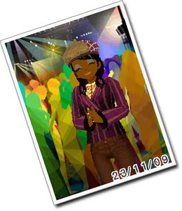
Oh, and as a side note, despite the child-friendly arrangement of it all, if you decide to get a 'Lover' in-game, you may marry and then have sex with the significant other. In glorious, poorly modeled 3D. I've not seen it first hand (I'm a clean little games reviewer), but when I saw the item shop stocked condoms, the camp playing experience suddenly became a hell of a lot more awkward...
Subscribe to:
Posts (Atom)